How to Choose the Perfect Montessori Tower Color for the Nursery and Kitchen
When choosing a Montessori Tower for your child, most parents focus on functionality and safety. But have you ever considered how color can influence your child’s experience and the harmony of your home? The 2025 trends bring fresh ideas for Montessori-inspired nurseries and child-friendly spaces. Let’s explore how to pick the perfect shade for your YokoTower Montessori Tower!
The Impact of Color in a Child’s World
Colors aren’t just an aesthetic choice—they affect emotions, concentration, and even behavior. Here are a few examples:
- Neutral and Natural Tones (white, beige, light wood) – Create a calm and harmonious environment, ideal for a nature-inspired Montessori bedroom.
- Pastel Tones (sage green, light blue, dusty pink) – Promote creativity and emotional balance.
- Vibrant Colors (yellow, orange, deep blue) – Stimulate energy and engagement in daily activities.
Choosing the right shade for your Montessori Tower is not just about matching your home decor—it’s about creating a space that supports your child’s development naturally and harmoniously.
2025 Color Trends: Which Shades to Choose?
For 2025, color trends are inspired by nature and tranquility. Here are some shades that will dominate Montessori nurseries and modern kitchens:
Sage Green & Olive Green – Relaxing and focus-enhancing, perfect for quiet spaces and kitchens where children participate in daily activities.
Terracotta & Warm Beige – Earthy, soothing tones, ideal for Montessori-style nurseries.
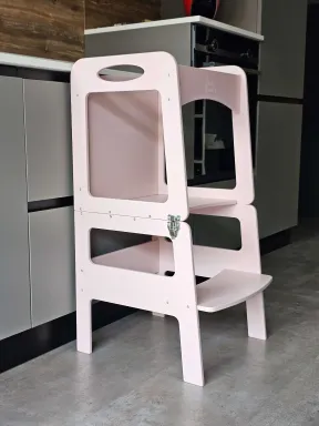
Dusty Pink & Lavender – Soft and cozy hues, great for creating a warm and inviting atmosphere.
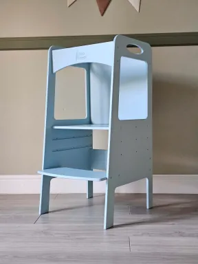
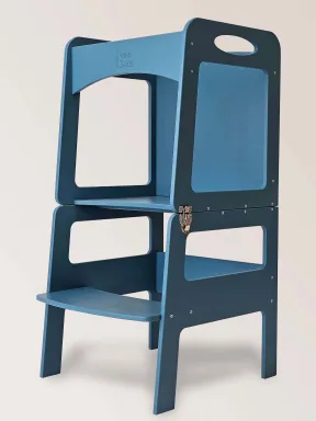
Airforce Blue & Powder Blue – Elegant and sophisticated tones, perfect for stimulating creativity and imagination.
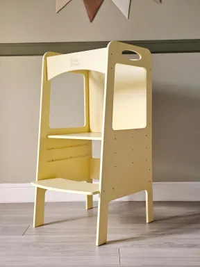
Mustard Yellow & Ochre – Bright and energetic, these shades bring warmth and vibrancy, making them ideal for kitchens or play areas.
How to Match Your Montessori Tower to Your Home
To ensure that your Montessori Tower blends seamlessly into your space, consider these tips:
- If your child’s room has light wood or white furniture, opt for pastel tones like sage green, beige, or powder blue for a harmonious effect.
- For a modern kitchen with neutral colors, choose a deep blue or ochre yellow to add personality.
- If you prefer a minimalist and timeless look, go for a classic white or natural wood finish.
The YokoTower Montessori Tower: Functionality & Style
At YokoTower, we believe that every detail matters when choosing products for children. Our Montessori Towers are available in a variety of colors, designed to fit perfectly in both the nursery and kitchen. Made with natural materials and ergonomic designs, each tower is a true companion in your child’s growth, helping them become independent and engaged in daily activities.
If you’re considering buying a Montessori Tower, now you know that color is more than just an aesthetic choice—it’s a way to create an environment that best supports your child’s growth!
Which color would you choose for your Montessori Tower? Explore our collection and find the perfect shade at YokoTower!


Comments (0)